
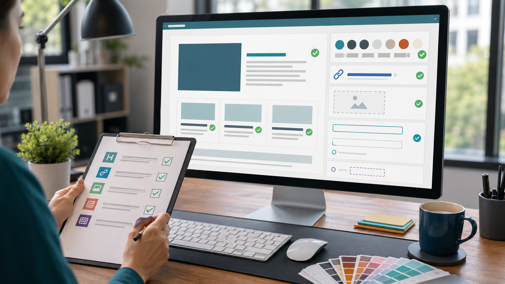
Accessibility problems often enter a website through ordinary publishing work. A page template may be solid, the theme may be well built, and the development team may have handled the structural pieces carefully. Then a new landing page, event recap, resource article, or campaign page gets assembled in WordPress, and the issues appear in the content layer: skipped headings, vague links, missing image descriptions, low-contrast callouts, embedded forms without clear instructions, or blocks arranged in a way that only works visually.
That is why accessibility QA should not be treated as a one-time website audit. It needs to be part of the publishing workflow. The goal is not to turn every editor into an accessibility engineer. The goal is to give content, marketing, and operations teams a practical review process that catches common barriers before the page is published.
The W3C Web Content Accessibility Guidelines 2.2 explain a wide range of accessibility requirements for web content. WordPress also provides practical guidance through the Make WordPress Accessibility Handbook, including guidance for alternative text. For most publishing teams, the useful question is: how do those standards show up in the day-to-day act of editing a page?
Accessibility QA Belongs Before Publish, Not After Complaints
Many teams handle accessibility reactively. Someone reports that a link is confusing, a form is hard to use, or an image has no meaningful description. The page is already live, the campaign is already running, and the fix becomes urgent.
A better workflow puts a short accessibility review between final edit and publish. This does not replace deeper design, development, or automated testing. It gives the publishing team a defined checkpoint for the things they can reasonably control inside WordPress.
That checkpoint should answer a few practical questions:
- Can someone understand the page structure from the headings alone?
- Do links describe where they go or what action they perform?
- Do meaningful images have useful alternative text?
- Are forms, buttons, and embedded tools understandable without guessing?
- Can the main path through the page be used with a keyboard?
- Does the page still make sense on mobile, at higher zoom, and without relying only on color?
Those questions sound simple, but they prevent a surprising amount of friction.
Start With the Page Outline
Headings are more than large text. They create the structure of the page. A visitor who scans visually uses headings to understand the argument. A screen reader user can also navigate by headings, which means a messy heading order can make the page feel disorganized even when it looks polished.
Before publishing, review the page as an outline. The page should have one clear main topic. Major sections should use heading levels in order, and headings should describe the section that follows. Avoid choosing a heading level because it looks better visually. If the design needs a different size, solve that in the block style or template, not by breaking the document structure.
In WordPress, this often means checking reusable patterns, Elementor sections, post templates, and manually styled text blocks. A line of bold text may look like a heading, but assistive technology may not treat it as one. The reverse problem also happens: a heading block may be used only for visual emphasis even though it does not introduce a real section.
Make Links Understandable Out of Context
Links should make sense without forcing the reader to inspect the surrounding paragraph. Text like “click here,” “read more,” or “learn more” can be confusing when several links appear on the same page. It also makes analytics and content governance harder because the destination is not clear from the content itself.
A stronger link describes the destination or the action. “Review the volunteer application requirements” is more useful than “click here.” “Download the sponsorship packet” is clearer than “learn more.” This small editorial habit helps accessibility, search clarity, and content maintenance at the same time.
During QA, scan every link and button label. Ask whether a reader would know what happens next. If several links use the same generic phrase but point to different destinations, rewrite them before the page goes live.
Treat Image Descriptions as Content, Not Decoration
Alternative text should communicate the purpose of an image in context. A headshot, chart, product photo, event image, and decorative background do not all need the same kind of description. The W3C WCAG quick reference frames this around text alternatives for non-text content: if the image communicates information, that information needs a text alternative.
For WordPress publishers, the most important step is to decide whether the image is meaningful. If the image supports the message, write concise alt text that explains the relevant information. If the image is purely decorative and the implementation allows it, it may need an empty alt attribute so it can be skipped. If the image is a chart or diagram, the page may need nearby explanatory text, not just a short alt field.
A common content problem is using the file name, title field, or caption as a substitute for good alt text. Those fields are not interchangeable. QA should include opening each image in the editor or media library and confirming that the alt text matches the page context.
Review Forms as a Full Interaction
Forms are where accessibility, data collection, and operations meet. A form can look tidy and still create problems if labels are missing, required fields are unclear, error messages are vague, or the confirmation step does not tell the user what happened.
Before publishing a page with a form, test it as a user. Can you tell which label belongs to each field? Are required fields marked in a way that does not rely only on color? If a field has instructions, are they visible before submission? If the form produces an error, does the message explain what needs to be fixed?
This matters beyond accessibility. Poor form QA can also damage data quality. If people misunderstand a field, skip a required choice, or abandon the form because the error state is unclear, the organization loses useful information. For DigitalWerks, this is where content QA connects directly to analytics, CRM handoffs, surveys, and digital operations.
Check Contrast, Focus, and Reading Order
Some accessibility issues are hard to judge by looking at the page in the editor. A callout may have attractive colors but poor contrast. A button may look obvious with a mouse but become difficult to find with keyboard navigation. A two-column layout may read in an unexpected order on mobile or through assistive technology.
Use automated tools where they help, but do not rely on them as the whole review. Automated checks can catch missing alt text, some contrast failures, and certain structural issues. They cannot fully judge whether link text is meaningful, whether an image description is useful, or whether the page makes sense as a reader moves through it.
A practical QA pass should include previewing the page on desktop and mobile, tabbing through interactive elements, checking visible focus states, and reviewing any embedded widgets or third-party forms. If an embedded tool is central to the page, it deserves the same scrutiny as the WordPress content around it.
Build Accessibility Into the Publishing Checklist
The best accessibility QA process is short enough to actually happen. A 40-point checklist that no one uses will not improve the site. Start with a repeatable checklist that fits the publishing team’s normal workflow:
- Confirm the heading outline is logical.
- Rewrite vague link and button text.
- Check alt text for meaningful images.
- Review forms, labels, required fields, errors, and confirmations.
- Check color contrast on important text and buttons.
- Use the keyboard to move through links, buttons, menus, and forms.
- Preview the page on mobile and at higher zoom.
- Confirm embedded content does not create the only path to important information.
Make someone accountable for the review before publish. In a small team, that may be the editor. In a larger organization, it may be a content operations role, web manager, or QA reviewer. The important part is that the step is visible, repeatable, and tied to the publishing decision.
Keep the System Maintainable
Accessibility QA becomes easier when the WordPress system supports good habits. Templates should use proper heading structure. Button and link styles should meet contrast expectations. Reusable blocks should be reviewed before they are copied across dozens of pages. Form patterns should include labels, help text, error states, and confirmation messages by default.
When the system carries more of the accessibility work, editors make fewer one-off decisions. That is the difference between asking every publisher to remember everything and designing a workflow where the right choices are easier to make.
DigitalWerks often sees accessibility issues emerge at the intersection of content, design, development, analytics, and operations. A page is not just words on a screen. It is a path through information, forms, links, tracking, and follow-up systems. Accessibility QA helps make that path clearer for more people while also improving the reliability of the organization’s digital work.
Conclusion
Accessibility is not only a development concern and it is not only a compliance project. It is part of everyday publishing quality. WordPress teams can catch many common issues before launch by reviewing structure, links, image descriptions, forms, contrast, focus, and mobile behavior as part of the normal editorial process.
If your organization publishes important content through WordPress, DigitalWerks can help review your templates, editor workflows, forms, and QA process so accessibility becomes a practical habit instead of a last-minute repair.