
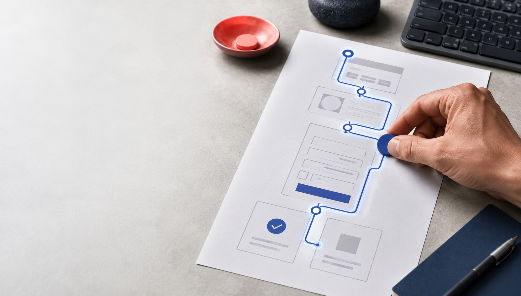
A green accessibility score can coexist with a frustrating, unusable website. Automated scanners are good at finding detectable patterns, such as missing labels, low contrast, or invalid markup. They cannot reliably tell you whether a person can complete the important journey on your WordPress site, especially when that journey includes a menu, a modal, a multi-step form, validation errors, or a success message.
That distinction matters because a website is not a collection of isolated pages. It is a sequence of actions. A visitor opens the navigation, finds the right page, completes a form, corrects a mistake, and confirms that the submission worked. Accessibility testing should follow that sequence.
Use automated scans as a map, not a verdict
Accessibility evaluation tools can identify many potential barriers quickly, which makes them useful during development and maintenance. W3C’s Web Accessibility Initiative also cautions that tools cannot check every accessibility aspect automatically and cannot determine accessibility on their own. Human judgment remains necessary. W3C’s guidance on selecting evaluation tools describes automated checks as assistance, not a complete conformance decision.
In a WordPress project, a scan can help a developer locate a missing form label or a heading-order problem. It may not reveal that a keyboard user becomes trapped in a menu, that a focus indicator disappears against a brand color, or that an AJAX error appears visually but is never announced. Those are workflow problems. They emerge when someone tries to use the page.
A useful testing record separates three things:
- Detected issue: what the tool found in the page structure or rendered output.
- Observed barrier: what a person could not understand, reach, operate, or complete.
- Validation evidence: the browser, device, assistive technology, user path, and result that support the conclusion.
Start with the journeys that matter
Before testing a WordPress page, write down the actions that define success. For a service website, that might be opening the main menu, reading a service page, requesting a consultation, and finding the confirmation message. For a nonprofit, it could be reaching a donation form, choosing a recurring option, entering contact information, and recovering from a validation error. For an ecommerce site, it may include search, filtering, account sign-in, checkout, and order confirmation.
Choose a small set of representative flows instead of scanning every URL without context. Include at least one path that contains dynamic behavior. A page builder, form plugin, cookie banner, slide-out menu, accordion, or modal can change the accessibility experience after the initial page load.
Record the expected path in plain language. For example:
- Open the home page and move through the header with the keyboard.
- Open the services menu and move to the target link without losing focus.
- Submit the inquiry form with one required field empty.
- Find the error summary and move directly to the field that needs attention.
- Correct the field and submit again.
- Confirm that the success message is perceivable and that focus lands somewhere sensible.
This path gives the team something concrete to retest after a theme, plugin, template, or JavaScript change.
Test the keyboard path from the first interaction
Start with a fresh page load and use the keyboard only. Do not use the mouse to rescue the test. Press Tab and Shift+Tab through links, buttons, form controls, menus, dialogs, and any custom interactive elements. The focus indicator should remain visible, the order should make sense, and every control should be operable.
Pay special attention to WordPress behaviors that often come from a theme or page-builder component:
- A skip link exists but is invisible when it receives focus.
- A menu opens on click but cannot be opened or closed from the keyboard.
- A submenu receives focus in an order that does not match the visual layout.
- A modal opens, but focus remains behind it or escapes into the page underneath.
- An accordion changes state without exposing whether it is open or closed.
- A custom button is built from a generic element and never receives keyboard focus.
WCAG 2.2’s keyboard-accessible guidance defines the basic expectation clearly: functionality should be available from a keyboard. The W3C explanation of keyboard accessibility also helps teams distinguish keyboard support from mouse-specific behavior.
Test at different viewport widths. Responsive navigation often swaps one component for another, which means the desktop menu can pass while the mobile menu traps focus or hides the close control.
Inspect form labels, instructions, and errors
Forms deserve their own pass because a successful page scan does not prove that a visitor can understand or recover from the form. Each input needs an accessible name that explains its purpose. A visible label should be associated with the corresponding control, not replaced by placeholder text.
W3C’s forms guidance recommends explicit label relationships, clear instructions, and error messages that identify the affected field and explain how to correct it. The WAI labeling tutorial explains why a label and control need to be associated in the markup. WordPress’s theme accessibility guidance likewise states that a placeholder is not a replacement for a label and that form focus should remain visible.
Test the form with realistic mistakes:
- Leave one required field blank.
- Enter an invalid email address or an unexpected date format.
- Choose an option that reveals another field.
- Submit with JavaScript enabled and observe the dynamic response.
- Submit with the keyboard and check where focus goes after the response.
An accessible error experience should answer three questions quickly: what went wrong, where did it go wrong, and what should I do next? An error summary near the top can help, but it should also identify the field and provide a usable link or focus path. Inline errors should be programmatically associated with the control when the interface depends on dynamic updates.
Do not forget the data workflow behind the form. A visitor may correct the visible field while a hidden field, tracking value, or integration request still fails. Accessibility and data quality are connected here: a form is not complete when the browser shows a success state; it is complete when the user receives understandable confirmation and the expected record is stored in the intended system.
Check announcements and focus after dynamic changes
Modern WordPress sites frequently update content without a full page load. Filters refresh results, forms display validation messages, cookie banners change available controls, and search suggestions appear as someone types. A scanner may inspect the initial DOM and miss what happens after the update.
For each dynamic change, ask:
- Can a keyboard user reach the new content?
- Does the interface expose the control’s current state?
- Does focus move when it should, and stay put when it should?
- Is important feedback announced to assistive technology?
- Can the visitor close, undo, or repeat the action?
W3C’s guidance on form notifications recommends concise success and error feedback, including an identifiable error list and references to the associated controls. The WAI notifications tutorial covers both overall feedback and inline feedback for dynamic form behavior.
Use a repeatable WordPress QA record
Accessibility testing becomes much more useful when it is tied to a release process. Keep a short record for each important flow:
| Test area | Evidence to record |
|---|---|
| Navigation | Keyboard order, focus visibility, menu state, and mobile behavior |
| Forms | Labels, instructions, required fields, invalid input, and preserved values |
| Dynamic feedback | Focus destination, announcement behavior, and success or error clarity |
| Content structure | Heading hierarchy, link purpose, meaningful button names, and page title |
| Responsive behavior | Same critical path at representative desktop and mobile widths |
| Regression check | Theme, plugin, template, JavaScript, and CSS changes that could affect the flow |
Run automated scans after the manual flow is defined, not instead of it. Use the results to find structural issues, then retest the user journey. If a tool reports a low-confidence finding, document the human decision rather than blindly changing markup. If a tool reports no errors, keep the workflow evidence. “No automated findings” is not the same as “the journey is accessible.”
Fix the system that creates the barrier
When a WordPress accessibility issue appears, the durable fix may belong in a theme component, a reusable block, a form template, a plugin configuration, or a shared JavaScript behavior. Editing one page can hide the symptom while leaving the same problem across the site.
Trace the barrier to its source. Compare the rendered HTML, the component settings, and the behavior at each breakpoint. Check whether a plugin update, CSS rule, or script changes focus management. Then add the affected journey to the release checklist so the fix is tested again after future changes.
DigitalWerks can review a WordPress site’s highest-value journeys, combine automated findings with keyboard and form-flow testing, and connect accessibility fixes to the site’s content, forms, integrations, and launch process. The practical next step is to choose one critical path, document what success should feel like, and test it from the visitor’s point of view.