
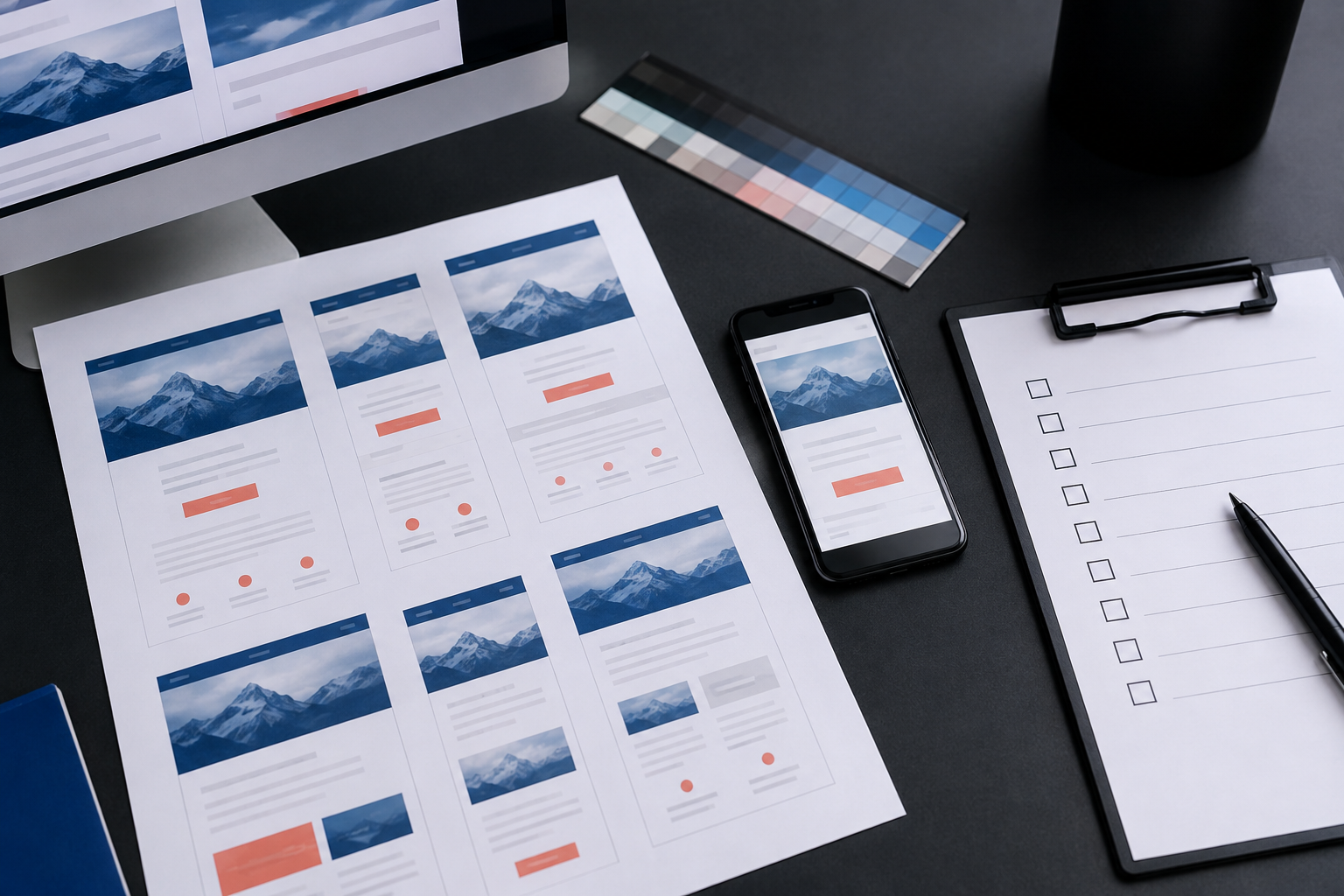
An email can look correct in the template builder and still break when a subscriber opens it. A button shifts, a two-column section stacks badly, an image disappears, or a dark-mode client changes the contrast enough to make the message hard to use.
That is why email QA needs to happen against the rendered message, not just the source template. A practical process checks structure, content, links, accessibility, tracking, and client-specific behavior before a campaign is scheduled.
Start with the template’s real job
Before opening a preview tool, write down what the message must help the subscriber do. Is the goal to register, read an update, complete a form, renew a membership, or make a purchase? The answer determines which parts of the template deserve the most attention.
A reusable template should make the primary action obvious, preserve a readable fallback when images are blocked, and keep the content hierarchy intact when the viewport changes. QA is easier when the team knows what “working” means before it starts reviewing pixels.
Build a repeatable test matrix
Email clients do not render HTML in one consistent browser engine. The same markup can behave differently in desktop Outlook, webmail, mobile apps, and dark-mode settings. You do not need to test every possible device on every send, but you do need a defined matrix that reflects your audience.
- Desktop: Include the desktop clients that matter to your subscribers, especially if the audience includes organizations that standardize on Outlook.
- Webmail: Test common browser-based inboxes at more than one width. Check the message in both a wide window and a narrow window.
- Mobile: Review at least one iOS and one Android path when mobile subscribers are part of the audience.
- Theme settings: Check light mode and dark mode. Look for logos with transparent backgrounds, low-contrast text, and buttons whose colors are altered by the client.
- Content states: Test long headlines, missing images, long names, empty optional fields, and translated or expanded copy when those values can occur.
Record the matrix in a shared checklist. A template is easier to maintain when the team can see which clients were tested, when they were tested, and which exceptions are known and accepted.
Check structure before styling
Start with the email’s skeleton. Confirm that the message has one clear subject-level hierarchy, a logical reading order, and a sensible fallback when a responsive rule is ignored.
Look for common structural failures:
- Two columns that become too narrow to read or fail to stack on small screens.
- Buttons that depend on background images or unsupported CSS to remain visible.
- Images that have no defined width or height and cause the layout to jump while loading.
- Content blocks that rely on absolute positioning, unsupported margins, or fragile web fonts.
- Nested tables or spacer elements that create unexpected gaps in one client.
For email, conservative HTML is often more dependable than clever HTML. Table-based layout, inline styles, explicit widths, strong fallbacks, and restrained use of advanced CSS may feel old-fashioned, but they make the template more predictable across the environments that subscribers actually use.
Review the subscriber experience
Once the structure is stable, review the message as a person receiving it. Does the preheader add useful context, or does it expose navigation text and template fragments? Does the headline explain why the email matters? Can someone identify the main action without reading every paragraph?
Check the full path from inbox to destination:
- Subject line and preheader match the actual message.
- Headline, body copy, and call to action agree about the next step.
- Every visible link goes to the expected destination.
- Buttons have a large enough target area for touch interaction.
- Unsubscribe and preference links are visible and usable.
- Footer information remains legible when the message is viewed on a phone.
Do not limit the review to a perfect content sample. Use realistic edge cases. A personalized greeting that wraps to three lines, a product name with an unusually long word, or a missing optional image can expose a template problem that a polished preview will hide.
Validate accessibility and content resilience
Email accessibility is part of template QA because the message still needs to work when someone uses a screen reader, increases text size, blocks images, or navigates with a keyboard.
Confirm that images have meaningful alternative text when they communicate information. Decorative images should not force a screen reader user through irrelevant descriptions. Keep text as real text rather than placing all of the message inside one image. Use sufficient color contrast and do not make color the only way to distinguish status or priority.
Then turn images off. The message should still explain its purpose, identify the action, and provide enough context to make the next step understandable. A missing hero image should reduce polish, not remove the meaning of the campaign.
Inspect links, tracking, and dynamic content
A visually correct email can still fail operationally if its links or data are wrong. QA should validate the destination, the link parameters, and the way dynamic values are inserted.
- Open every call-to-action link, logo link, preference link, and footer link.
- Check that UTM parameters follow the campaign naming rules used by the reporting team.
- Confirm that personalization tokens resolve to the correct value and that a fallback exists when a field is empty.
- Verify that dynamic content shows the right variant for each audience segment.
- Check that unsubscribe, preference, and suppression behavior is connected to the correct list or profile.
- Make sure links are not accidentally double-encoded, truncated, or pointed at a staging domain.
Keep test data separate from production audience data. A good QA workflow makes it clear which records were used for testing, what each record was expected to receive, and whether test clicks or submissions should be excluded from campaign reporting.
Test the code as a reusable component
When an email template uses shared modules, test both the module and the assembly. A button can work inside one content block and fail when it inherits a different font size, table width, or background color from another block.
For each reusable component, check:
- Normal, long, and empty content states.
- Light and dark backgrounds.
- Desktop, narrow, and mobile widths.
- Image loading and image blocking.
- Link focus, hover, and visited states where the client supports them.
- Interaction with neighboring modules above and below it.
Keep a short component-level note for known client exceptions. That lets the team distinguish a deliberate fallback from a new regression and prevents the same investigation from happening every time a campaign is built.
Use a release decision, not just a screenshot review
Screenshot comparisons are useful, but they should support a release decision rather than replace one. Before scheduling the campaign, record whether the message passed the agreed client matrix, whether any exceptions were accepted, and who approved the final content and links.
A simple release record can include:
- Template or campaign version.
- Test records and audience variants used.
- Clients, devices, and theme settings reviewed.
- Link and tracking validation results.
- Accessibility and image-blocking results.
- Open issues, owner, and decision to fix, accept, or delay.
This turns email QA into an operational control. When a rendering bug appears after launch, the team can trace which version was sent, what was tested, and whether the problem came from the template, the content, a client change, or a data condition.
Make QA part of template maintenance
Email clients change, email platforms change, and reusable templates accumulate small edits over time. Re-run the matrix when the template structure changes, when a new audience or sending platform is added, or when a known client changes its rendering behavior.
DigitalWerks can help review an email template system as both a subscriber experience and an operational workflow: HTML structure, responsive behavior, accessibility, links, UTM governance, content variants, platform handoffs, and repeatable approval steps. Need a practical email QA process before your next campaign? Talk with DigitalWerks about the template and workflow you need to validate.
Conclusion
The goal of email QA is not to make every client render the message identically. The goal is to make the message dependable: readable, accessible, on-brand, correctly linked, and useful across the inboxes your audience actually uses.
Test the rendered experience, include realistic content states, validate the data and tracking behind the links, and keep a release record. That discipline catches the quiet failures that a template builder preview cannot see.