
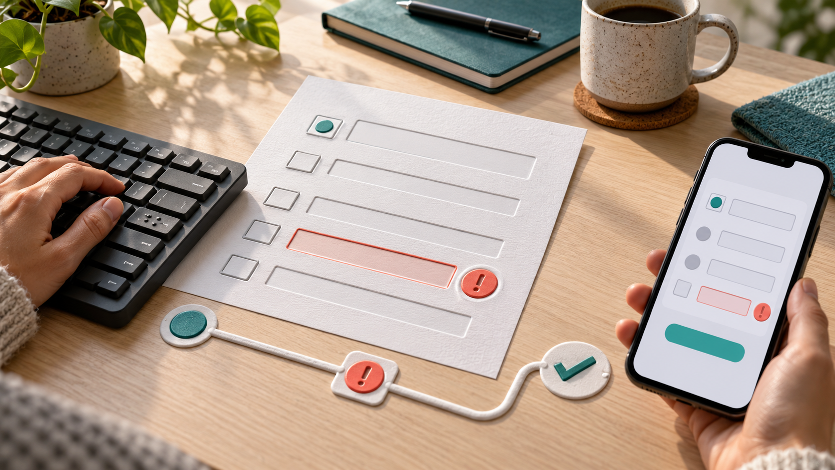
A survey can be technically online and still be difficult or impossible for someone to complete. A missing label, a keyboard trap, an error message that appears only by color, or a mobile layout that hides the correction path can turn a short questionnaire into an abandoned task.
Survey accessibility testing should examine the whole workflow, not just whether the form submits. The participant needs to understand each question, move through controls, recover from mistakes, finish on a small screen, and receive a reliable confirmation. The response then needs to arrive in the right export, CRM, or reporting workflow without losing the context that made the submission usable.
Start with the participant’s route, not a checklist
Before testing individual controls, map the route a participant takes:
- Open the invitation or survey link.
- Understand the purpose, estimated effort, and any privacy expectation.
- Move through each question using a keyboard, touch input, or assistive technology.
- Recognize required fields and instructions.
- Correct any invalid answer without losing earlier responses.
- Submit the survey and understand whether it was accepted.
- See the expected confirmation and, when appropriate, trigger the next system handoff.
This route matters because a control can pass an isolated test and still fail in context. A visible error may be below the fold. A focus indicator may disappear after a conditional question opens. A completion message may be visible to a mouse user but not announced to a screen reader. Treat the workflow as one experience with both a user-facing path and a data path.
Give every question a clear, programmatic name
Each input needs a visible label that explains what information the participant should provide. The label should be associated with the control in the underlying markup, not positioned near it by appearance alone. The W3C’s forms guidance recommends using a label element and matching its for attribute to the control’s id.
Check more than text fields. Test radio groups, checkboxes, select menus, date controls, file uploads, rating scales, and custom widgets. A question such as “How satisfied are you?” needs a meaningful group label, instructions for the scale, and an accessible name for each option. If a custom component looks like a button or menu, it also needs the correct role, state, and keyboard behavior.
Do not use placeholder text as the only label. It can disappear when someone starts typing, may be difficult to perceive, and does not reliably explain the field after an error. For common personal-data fields, consider whether the input purpose can be identified programmatically with an appropriate autocomplete value. WCAG 2.2 includes this as a Level AA success criterion because identifying input purpose can make forms easier to complete across different modalities.
Test the survey without a mouse
Run the entire survey with a keyboard. Use Tab and Shift+Tab to move forward and backward, Enter or Space to activate controls, and the arrow keys where a radio group or custom control expects them. The focus order should follow the visual and question order. Focus should remain visible, and opening a conditional section should not move the participant to an unexpected place.
Watch for common failures:
- A required custom control can be clicked but never reached with the keyboard.
- A modal or help panel opens without moving focus inside it or returning focus afterward.
- A “Next” button becomes visible but is skipped because it is inserted incorrectly in the focus order.
- A question is hidden visually but remains in the keyboard sequence.
- A progress indicator updates visually without exposing the current step to assistive technology.
Keyboard testing is especially important for multi-page surveys. A participant should be able to move backward, review answers, and continue without losing completed data. If the platform saves partial responses, test the resume path too. A resume link should return the participant to the right state without exposing a sensitive identifier in a way that can be copied or forwarded casually.
Make errors understandable and recoverable
A submission error is part of the survey experience, not an edge case. Test invalid email formats, missing required answers, conflicting dates, incomplete file uploads, and any business rule that can reject a response. The W3C’s WCAG 2.2 guidance says that automatically detected input errors should identify the item in error and describe the problem in text.
A useful error workflow has four parts:
- Identify the field or question that needs attention.
- Explain what is wrong in plain language.
- Tell the participant how to correct it.
- Keep valid answers and return focus to a sensible place.
Do not rely on a red border, an icon, or a message that disappears after a timeout. Put the message next to the relevant control and provide a summary when several fields fail. Make sure the error is available to assistive technology and remains visible at normal zoom and on small screens. Test whether a screen reader announces the error when the participant submits, and whether the correction can be completed without restarting the survey.
Check mobile completion as a real workflow
Responsive styling is only one part of mobile accessibility. Test the survey on a small screen with zoom enabled and with the device’s text size increased. Confirm that questions, options, help text, error messages, and buttons remain visible and do not require horizontal scrolling.
Use the right input types when they match the question. An email field should offer an email-friendly keyboard, and a telephone field should not force a participant to hunt through a full keyboard. Keep tap targets separated enough to avoid accidental selections, especially for tightly packed radio buttons or rating scales.
Repeat the same checks after branching changes the page. Conditional content can push an error message far away from the field that needs correction, cover the next button, or create a layout that works on desktop but not on a phone. Capture the viewport, browser, operating system, survey step, and question state for every issue so someone else can reproduce it.
Validate the handoff after the screen says “complete”
Accessibility testing does not end at the confirmation screen. A participant may have completed the survey correctly while the response is later rejected, attached to the wrong record, or omitted from the report.
For a test submission, record the path from the survey platform to its destination:
- Which survey version and response identifier were created?
- Were the expected answers stored, including values from conditional questions?
- Did the export or API payload preserve the question meaning and response status?
- Did the CRM or database match the response to the intended record?
- Did a failed handoff create a visible retry or review item?
- Does the confirmation shown to the participant match the actual stored state?
Keep test data clearly marked and separate from production reporting. If the survey passes a hidden identifier or token, validate that the value is present where expected, protected in logs, and not treated as proof that the participant’s answers are valid. The response payload still needs schema checks, required-field rules, and reconciliation against the source survey.
Build an accessibility QA record that can be reused
For each release, keep a small QA record with the survey version, tested devices and browsers, keyboard path, assistive-technology notes, error cases, conditional paths, test response IDs, and handoff results. Record the expected behavior as well as the defect. “Error shown” is less useful than “missing email returns focus to the email field, explains the accepted format, keeps all prior answers, and creates one reviewable response state.”
Prioritize issues by whether they block completion, hide an error, expose sensitive data, or create incorrect downstream records. Fix blockers before polishing copy or visual spacing. Then retest the same path after the platform, theme, embed, script, or integration changes.
A survey is accessible when the whole path works
Accessible survey work combines clear labels, predictable navigation, understandable errors, mobile-friendly controls, and a trustworthy data handoff. A form that looks good in a desktop browser is only one part of that standard. The stronger test is whether people can complete the questionnaire in different ways and whether the organization can verify what happened afterward.
DigitalWerks can review a survey workflow across the participant experience, form configuration, response storage, exports, CRM matching, and reporting. The practical next step is a test plan built around the survey’s real paths, failure cases, and ownership boundaries.